CinecavD Serif Font
Uploaded by Nielson Caetano 𑁋 (1 Style)
#Serif, #typodermic fonts, #cinecav, #cinecavd, #captions, #typodermic, #cinecav serif, #cinecavd serif
Free for personal use
Ray Larabie

Description
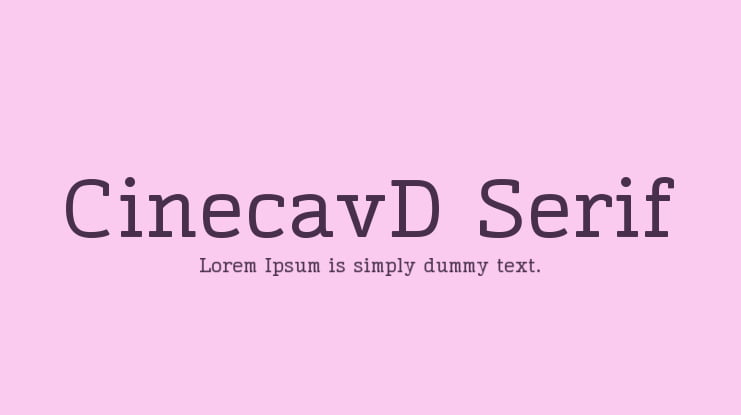
Cinecav Serif was built from Cinecav Sans with proportions similar to many popular, contemporary serif fonts. The optimum thickness of the serifs was determined through onscreen experimentation. Please read the designer’s notes below to learn more.
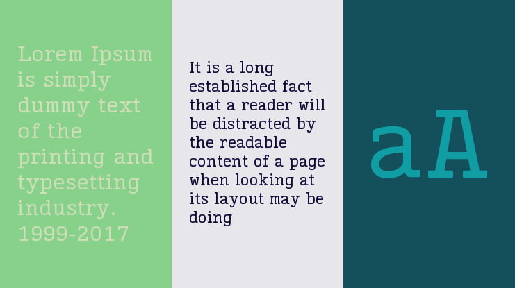
The horizontal serifs are the same thickness as the horizontal stems. The vertical serifs are slightly thinner than the vertical stems. I experimented with angled “wedge” serifs but fond that the subtlety was lost onscreen at lower resolutions … at higher resolutions, angled serifs simply looked fuzzy. I originally included a more traditional, binocular lowercase g but the shapes were too delicate for lower resolutions . . . the more modern style of g was much easier to read onscreen. The middle of the M was raised to prevent fill-in between the serifs and a similar trick was used on the capital and lowercase W. While most serif fonts include serifs on the punctuation, I decided to omit serifs for better clarity at lower resolutions. The copyright, registered, trademark, ampersand, monetary symbols, ordinals and fractions remain serifless.
Tags
#Serif, #typodermic fonts, #cinecav, #cinecavd, #captions, #typodermic, #cinecav serif, #cinecavd serif
Supported Languages
Unicode Blocks
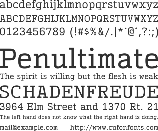
CinecavD Serif Regular Ver 2.001 𑁋 Modified at Sep 18, 2014

License
Cinecav is a trademark of Typodermic Fonts Inc.
Copyright © 2006-2014 Typodermic Fonts Inc. Do not distribute.
Before using this font, please carefully check the information provided under the license heading. The texts under the license heading are automatically generated from the font itself and may sometimes be incomplete. It is your responsibility to research the license information regarding the usage rights of the font you have downloaded. Protecting the intellectual property rights of font creators is of great importance; using a copyrighted and commercial font for free is illegal.
At CufonFonts, we attach great importance to intellectual property rights. If you believe that this typeface violates copyright laws and is not legal, please inform us for the removal or revision of the typeface. The legal authority of the typeface can make a request by using the "Report Violation" button above.
You can also use the links below to check the legal or commercial status of this font;
MyFonts.com Fonts.com
Your download will begin in a moment.
If it doesn't, restart the download.
Users who viewed this font also viewed

Free for personal use
Add to List
Free for personal use
Add to List
Free for personal use
Add to List
Available for Commercial Use
Add to ListSimilar Fonts

Free for personal use
Add to List
Free for personal use
Add to List
Free for personal use
Add to List
Available for Commercial Use
Add to List