Aerojones NF Font
Uploaded by zemin 𑁋 (1 Style)



Description
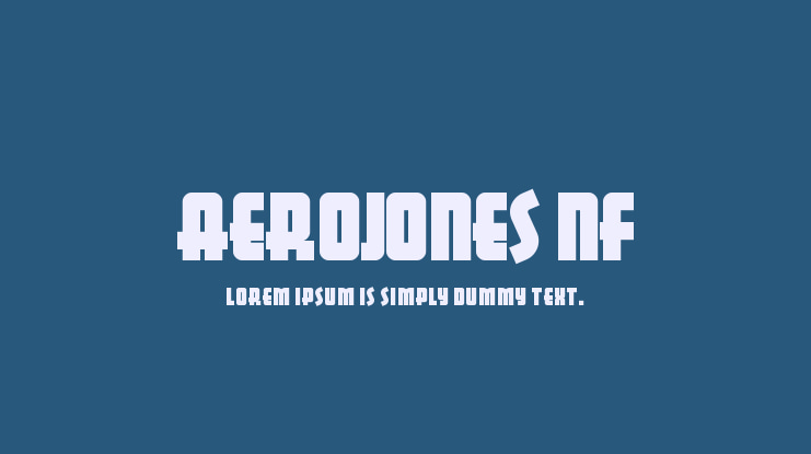
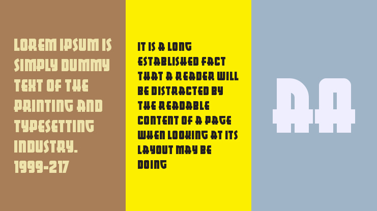
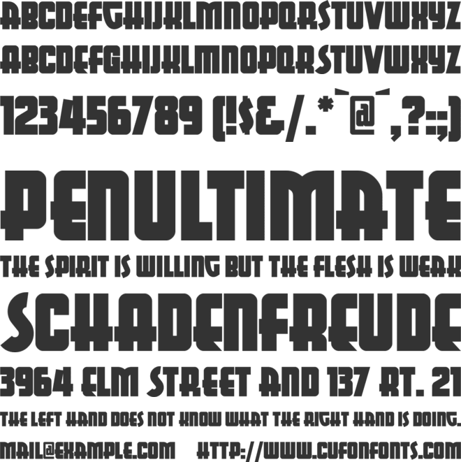
This display font, similar in concept to Huxley Vertical but much, much beefier, is based on lettering from a poster for Italo Oil, designed in 1993 by George Guillermaz. The name was chosen to highlight some of the font’s more interesting characteristics, and is based on the assumption that, if there’s an Aerosmith, there must be an …
Supported Languages
Unicode Blocks
AerojonesNF Ver 1.000 𑁋 Modified at Aug 26, 2002

License
Copyright (c) 2002 Nick Curtis. All Rights Reserved.
Before using this font, please carefully check the information provided under the license heading. The texts under the license heading are automatically generated from the font itself and may sometimes be incomplete. It is your responsibility to research the license information regarding the usage rights of the font you have downloaded. Protecting the intellectual property rights of font creators is of great importance; using a copyrighted and commercial font for free is illegal.
At CufonFonts, we attach great importance to intellectual property rights. If you believe that this typeface violates copyright laws and is not legal, please inform us for the removal or revision of the typeface. The legal authority of the typeface can make a request by using the "Report Violation" button above.
You can also use the links below to check the legal or commercial status of this font;
MyFonts.com Fonts.com
Your download will begin in a moment.
If it doesn't, restart the download.
Users who viewed this font also viewed


Free for personal use
Add to List

Available for Commercial Use
Add to ListSimilar Fonts

Free for personal use
Add to List
Free for personal use
Add to List
Free for personal use
Add to List
Newly added fonts

Free for personal use
Add to List
Free for personal use
Add to List
Free for personal use
Add to List
Free for personal use
Add to List