In our font studio’s 10-year journey, we’ve designed 1.500.000+ glyphs. Try out TypeType fonts online!

We Have a Digital Font Catalog! Looking through our typefaces has become even more convenient. PDF Catalog of TypeType Fonts

Use font subscription! The full font library of 75+ fonts will always be at hand. See more

Buy font Try out the font

TT Bells

Single style: from $29 Full family: 10 styles from $140

Any questions about the font or licences? Write us.

Choose the fonts you want

Choose the fonts and licenses you want.

Then click the "Buy font" button.

25% OFF when you combine Desktop and Webfont licenses

Package offer: Save 52% on 10 styles
from  $140
from $29
from $29
from $29
from $29
from $29
from $29
from $29
from $29
from $29
from $29

Any questions about the font or licences? Write us.

Select font licenses

You must specify a font package or style before selecting a licence

Choose the licenses you want

The license is suitable for anyone who plans to use the font in logo design, images for websites and social media, as well as in print media, souvenirs, and merchandise.

This license is purchased by the number of workstations on which a designer will use the font.

Desktop license is paid for once. Full license text

On request

If you plan to use the font in headings or text blocks on your project site, choose this commercial font license.

Purchase price depend on the number of site visits per month.

Webfont license is paid for once. Full license text

On request

To use the font in applications for iOS, Android, Windows, Linux and other operating systems.

When choosing a license, we do not count the number of application downloads, but focus only on the number of created applications.

App license is paid for once. Full license text

On request

Suitable for placing banners, digital ads and posters on the Internet, as well as for advertising on social media.

The license options differ depending on the number of ad impressions.

Digital Ads license is paid for once. Full license text

On request

This license is for the use of a font in video content: blogging, on a YouTube or TV channel, in online or offline broadcasts.

Font license options depend on the amount of video content that uses the font.

This license is paid for once. Full license text

On request

Video game developers’ license. Allows you to embed a font in the video game code.

This license is paid for once. Full license text

On request

Suitable for those who will be using the font in e-books, magazines, interactive PDFs, or other publications.

This license is paid for once. Full license text

On request

The license is suitable for use on special sites and applications where users can create a product using the selected font without an additional font license.

This license is paid for once. Full license text

On request

This is the case when a font is not limited to one area of application, and you want to discover all the possibilities it offers.

For those who purchase an unlimited licence, we often make font customisation as a gift.

Unlimited license is paid for once. Full license text

On request
No selected items
Total
$0

TT Bells

About font family

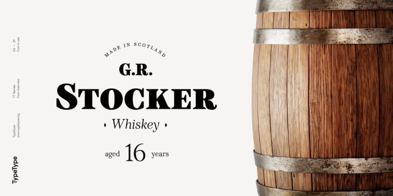
TT Bells combines the elegant softness of antiqua with a complex and daring temper reflected in straight stroke terminals and arrowheaded serifs. The family is based on broad nib, which was typically used for old style fonts and creates these hallmark terminals and serifs. We’ve taken the best from old style fonts created before the digital age and added sharp and contemporary geometric shapes to the traditional style. That’s how TT Bells refers the spectators and font enthusiasts to the origins and, at the same time, reminds us that we live in the digital era when geometry and screens rule the world.

TT Bells is suited for different types of text — from the shortest headings to large text arrays. When the font size is decreased, the boldness and sharpness of the font soften, it becomes more classic. The fontfamily is created according to the traditional TypeType formula (Thin, Light, Regular, Bold, Black & Italics)! We’ve also enabled the support of a broad number of OT features, which will help you widen the implementation range for this family: tnum, case, frac, ordn, sups, subs, numr, dnom, onum.

Language support

Team

Ivan Gladkikh—head of the project
Nadyr Rakhimov—type designer
Olexa Volochay—type designer

Release date

October 18, 2016

Additionally

Specimen

Download font specimen (pdf)

Poster Images

Graphic presentation at Behance

Custom version

Looking for a custom version of this font?

TT Bells
Size
Otf
Turn on all

Elegant softness of antiqua with a daring temper

TT Bells
Size
Otf
Turn on all

The family is based on broad nib, which was typically used for old style fonts and creates these hallmark terminals and serifs. We’ve taken the best from old style fonts created before the digital age and added sharp and contemporary geometric shapes to the traditional style. That’s how TT Bells refers the spectators and font enthusiasts to the origins and, at the same time, reminds us that we live in the digital era when geometry and screens rule the world.

TT Bells
Size
Otf
Turn on all

When the font size is decreased, the boldness and sharpness of the font soften, it becomes more classic

TT Bells
Size
Otf
Turn on all

TT Bells is suited for different types of text

TT Bells
Size
Otf
Turn on all

flask (1912)

OpenType features

liga | Standard Ligatures

ff fl fj

ff fl fj

dlig | Discretionary Ligatures

ct sk

ct sk

onum | Oldstyle Figures

1638

1638

case | Case Sensitive Forms

({[H]})

({[H]})

Ideal font pairs with TT Bells

What is a font pair, and what does it serve for?

A font pair is a combination of two fonts within one text block. Most often, one of the fonts in a pair is a more expressive headline font, and the other one serves to communicate information. Such fonts complement each other and help designers solve various tasks, like highlighting key elements, adding emotional expressiveness to the project, or separating semantic blocks.

How to choose fonts for a project: Several general recommendations

To begin with, establish the project's tone. Choose the fonts that stylistically match the main idea. After that, you need to determine the functions of each font in the project and their hierarchy: which font will complement the design and which one will serve to attract attention as the main element. You need to assess the difference between the fonts and decide what kind of information each of them should convey. First, we recommend choosing the base font you will use most, and then you can find a suitable pair for it.

Core principles of font pairing and recommendations from designers

The main rule you should follow when matching two fonts is that both similarities and differences must be visible between them. You can highlight the coherence of fonts by the following characteristics: contrast, proportions, width, openness of characters, individual letter shapes, and overall tone. Feel free to experiment with different combinations. We also recommend analyzing the projects you like: this way, you can enhance your visual skills, elevate your knowledge base, and gain confidence in dealing with typography.

Similar fonts

      Choose the fonts and licenses you want.