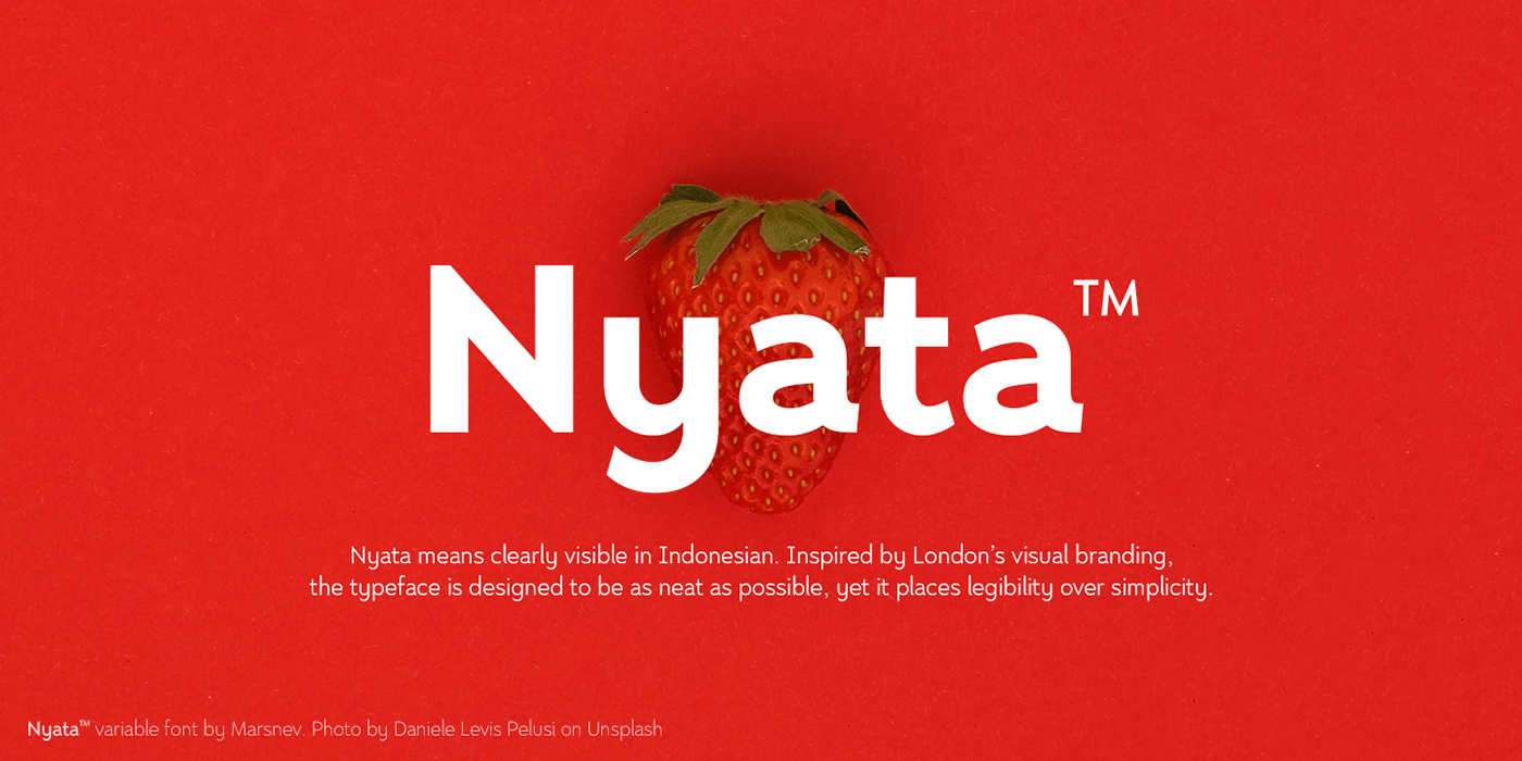
Nyata™ — Clearly Visible, No Matter What.
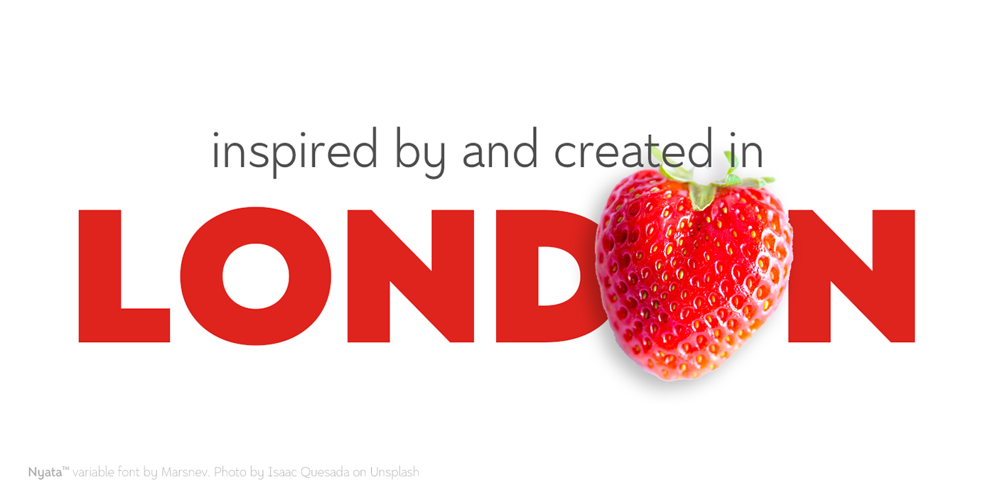
I love London for its finest visual branding, especially its Johnston typeface spreading all over the city. It inspired me to create this new font family: Nyata™.
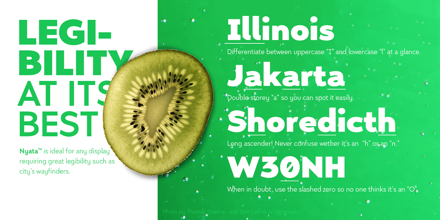
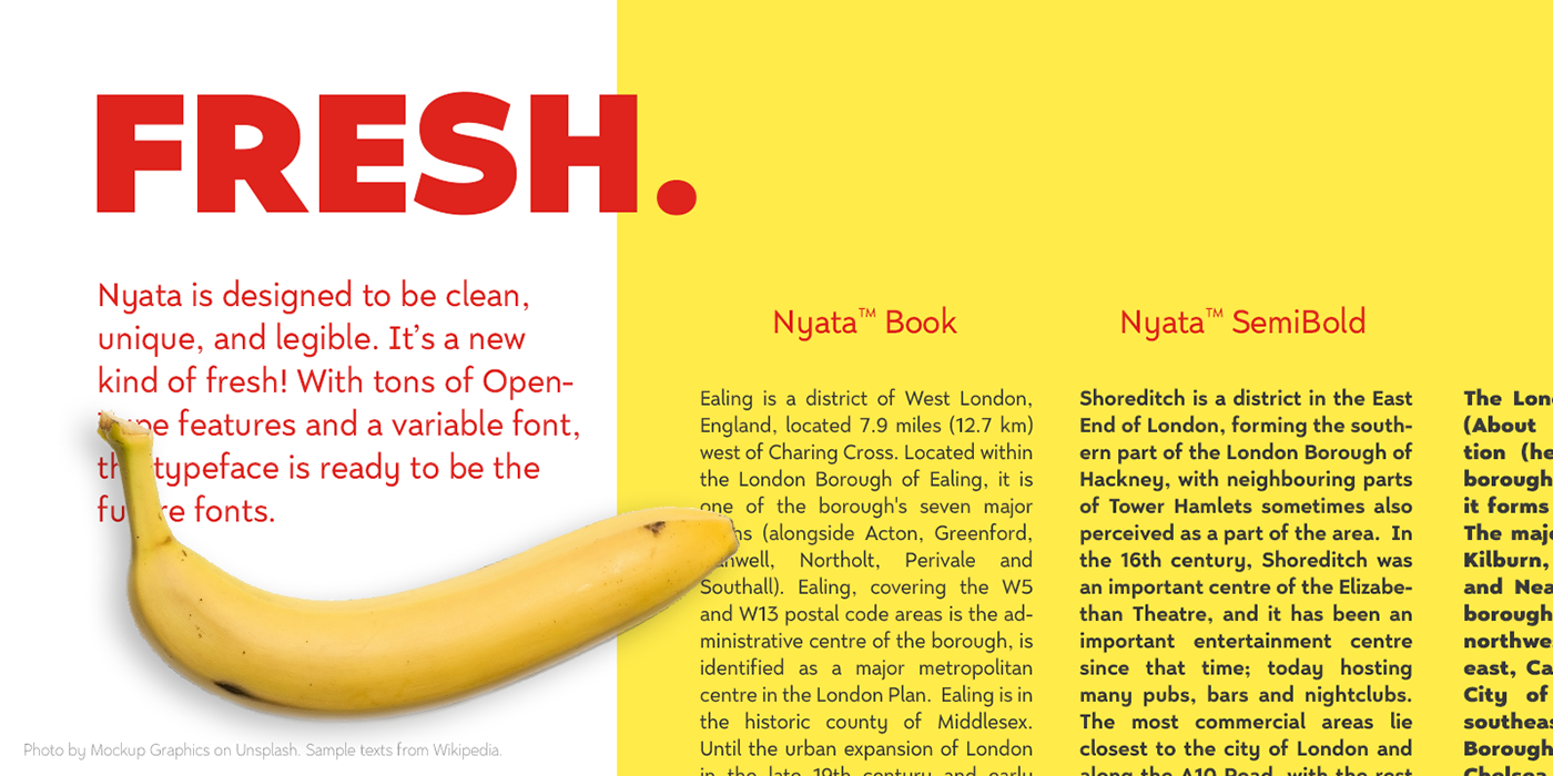
Nyata means clearly visible in Indonesian. The typeface is designed to be clean, unique, and legible. It is a great combination for any display requiring high legibility, such as city’s way finder. It also becomes the reason why the regular is at medium weight (500) instead of book weight (400).
Long ascenders help some characters more obvious. You will never confuse wether it is an "h" or an "n". Moreover, I tried to create all the letters are distinguishable. Of course, no time for people to doubt between Uppercase “I” and lowercase “l” when seeing a way finder. Last but not least, it is equipped with tons of OpenType features such as slashed zero to help the words more obvious, or stylistic sets if you don’t fancy the serifed uppercase I.
Nyata™ is also delivered in Variable Font format. Enjoy all the styles and everything in between in one variable font at minimum size.
Purchase Nyata™ here: MyFonts
Download FTR version of Nyata™ here: FontsSpace